541-327-5045

Request a Quote

Category: Website Design Tips

  • How to Get the Most Value From Your Website

    How to Get the Most Value From Your Website

    Your website should work like a top salesperson that never sleeps. If it’s slow, thin on content, not showing up for relevant searches, or hard to use, you’re leaving money on the table. This guide covers the fundamentals that drive results and shows how adding a living, breathing Portfolio Manager turns a “standard site” into a growth engine.


    The Fundamentals That Matter
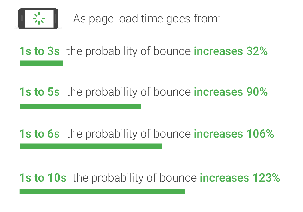
    1) Fast Loading

    • Why it matters: Speed influences user trust, conversion rates, and search visibility.
    • What to do: Optimize images, minify assets, leverage caching/CDN, and keep code lean.
    • Goal: Under ~2 seconds for key pages on typical mobile connections.

    2) ADA Compliance (Accessibility)

    • Why it matters: Expands your audience, improves UX for everyone, and reduces legal risk.
    • What to do: Use semantic HTML, labels for form inputs, sufficient color contrast, alt text on images, keyboard navigation, and ARIA descriptions where needed.
    • SEO impact: Accessibility improvements overlap with page experience signals Google uses in ranking (e.g., Core Web Vitals, mobile usability). Investing in accessibility strengthens these signals and can support better search visibility.

    3) Purpose-Built Landing Pages

    • Why it matters: Each core service/product deserves its own page to rank and convert.
    • What to do: Build focused pages with clear headlines, benefits, proof (photos/testimonials), FAQs, and a specific call to action.

    4) Smart Keyword Placement

    • Why it matters: Relevance and clarity help searchers and search engines.
    • What to do: Put plain-language keywords in titles, H1/H2s, image alt text, meta descriptions, and body copy. Avoid keyword stuffing; write for humans first.

    5) Fresh, Relevant Content

    • Why it matters: Recency and topic coverage correlate with visibility and user engagement.
    • What to do: Publish consistent, real-world updates tied to your services and outcomes.
    • SEO impact: Google favors fresh, relevant content that demonstrates expertise and satisfies search intent. A steady cadence of high-quality updates can improve discovery and engagement.

    The Missing Piece: Fresh Content at Scale

    Most businesses struggle to publish fresh content regularly. That’s where my Portfolio Manager changes the game. It makes it dead-simple to capture real projects photos, before/after sliders, location, job type, materials/colors, and customer testimonials—and publish them as optimized pages on your site.

    How it works in practice:

    1. You or your team upload project details from a phone or desktop.
    2. Images are automatically sized and compressed for fast loading.
    3. Optional before/after sliders showcase transformations.
    4. Each project becomes its own SEO-optimized page, linked from your portfolio and service pages.
    5. Share the URL to Facebook, LinkedIn, and Google Business Posts—they automatically generate a preview card with the project cover image, title, and short description. For Instagram, use the project cover image and place the URL in your bio or a Story link.

    Standard Site vs. Site with Portfolio Manager

    CapabilityStandard WebsiteWebsite + Portfolio Manager
    Fresh contentOccasional blog posts if time allowsEvery project becomes a post-worthy page automatically
    SEO coverage/page countLimited to a few core pagesDozens to hundreds of pages targeting real keywords and locations
    Proof & trustA few photos and generic testimonials, rarely updatedRich galleries, before/after sliders, detailed specs, and verified testimonials, regularly updated
    Social contentGeneric updatesShareable project pages that pull visitors back to your site
    Google Business ProfileSparse updatesFrequent posts with links to new projects; improved engagement signals
    Analytics insightsBasicGranular: see which job types, cities, drive views and inquiries

    Why This Boosts SEO and Rankings

    • Topical depth: Project pages build a wide base of related content around your services and locations.
    • Query matching: Real phrases your customers use (“cabinet repaint in North Albany,” “deck stain in Corvallis”) appear naturally in titles, headings, and alt text.
    • Internal linking: Project pages link to service pages (and vice versa), strengthening relevance.
    • Engagement signals: Faster, richer pages reduce bounce and encourage time-on-site.
    • Off-site signals: Sharing project pages on social and posting them to your Google Business Profile keeps your brand active and discoverable.

    No one can guarantee rankings. What we can do is systematically increase your surface area of relevance and the credibility of every page.


    How It Creates Ongoing Social Content

    Every published project gives you:

    • A compelling headline + timestamped proof
    • A gallery or before/after slider
    • A short blurb you can paste into Facebook, Instagram, LinkedIn, and Google Business Posts
    • A clean URL that points back to your site (not just an image on a social feed)
    • Auto-preview on Facebook, LinkedIn, and Google Business Posts: pasting the URL pulls the project cover image, title, and short description via OG/meta tags. (Instagram doesn’t auto-unfurl links in feed posts—use the image + link in bio or a Story link.)

    What Your Project Pages Include

    • Job type & custom options (e.g., “Job Type – Cabinets,” “Paint Color – White”)
    • City & state for local SEO
    • Project description and highlights
    • Photo gallery with compression for fast loading and alt text fields for ADA compliance and SEO
    • Before/after slider support
    • Optional customer testimonial with photo
    • Call-to-action (estimate request, phone, or booking link)

    Implementation Roadmap

    1. Audit & Tune Fundamentals: speed, accessibility, structure, tracking.
    2. Build or Refine Service Pages: one per core service/product with FAQs.
    3. Install Portfolio Manager: configure your job types/options; train your team.
    4. Publish Cadence: commit to a realistic rhythm (e.g., 4–8 projects per month).
    5. Distribute: share each project to social + Google Business Profile.
    6. Measure & Iterate: track impressions, clicks, and form submissions; adjust.

    FAQs

    Q: Will this get me better leads?
    A: It improves lead quality by showing real work, locations, and outcomes so buyers can self-qualify. You’ll attract customers looking for proof, not just low prices.

    Q: How quickly will I see results?
    A: You can see indexing and engagement within weeks; broader SEO momentum builds over months as your portfolio grows.

    Q: Can the job types and options be customized?
    A: Yes. Everything is tailored to your business—services, materials, colors, finish types, and more.

  • Does My Website Really Need a Cookie Notification?

    Does My Website Really Need a Cookie Notification?

    As you browse the internet, you’ve likely come across pop-ups that ask you to accept cookies or make a decision about which ones to accept. When I visit a website, I’m not there to be immediately forced to make a decision about how my cookies are handled. Is this really necessary?

    May we divert your attention and force you to make a choice?

    Please note this is not legal advice. It’s important to consult with legal professionals for specific legal advice.

    What are cookies and why do we need them?

    Cookies are small text files that are placed on your device by websites that you visit. They’re used to remember user preferences, login information, and other details that help improve your experience on a website. They can also be used to track user behavior for advertising purposes.

    In general, cookies are necessary for many websites to function properly. Without them, you may find yourself having to re-enter login information every time you navigate to a different page or losing items in your shopping cart.

    Common ways cookies are used

    1. Maintaining information from one page to another

    As mentioned earlier, cookies are commonly used to maintain information from one page to another. This can include login information, shopping cart items, and other details that help improve your experience on a website.

    1. Personalization

    Cookies can be used to personalize your experience on a website. This can include things like showing you relevant content, remembering your language preferences, and more.

    1. Analytics

    Cookies can be used to track user behavior on a website. This can help website owners understand how users interact with their site and make improvements based on that data.

    1. Advertising

    Cookies can be used for advertising purposes. This includes tracking user behavior across different websites to show more targeted ads.

    Are cookie pop-ups necessary for my website?

    In general, American websites don’t need cookie pop-ups unless they’re collecting personal data or are subject to GDPR regulations (Applies to European Union). However, it’s important for website owners to review their specific situation and consult with legal professionals to ensure compliance with any relevant regulations. Having a privacy policy that includes information about cookies your site uses that your visitors can choose to access is recommended.

    Why are cookie pop-ups so common?

    Despite not likely needing them, many American-based businesses have cookie pop-up boxes on their website. This is often because the warning box is included as part of the website template that was developed to be used by an international customer base, and website owners may not understand how to disable it, or whether it should be. So, do your website visitors a favor and consider dumping that cookie notification box.

  • Why Should I Care if my Website is ADA Compliant?

    Why Should I Care if my Website is ADA Compliant?

    What is ADA Compliance and How Does it Apply to Websites?

    The Americans with Disabilities Act was signed into law in 1990. This legislation prohibits discrimination and guarantees that people with disabilities have equal access and opportunity to participate in government and public services. Because of this law, public accommodations have been made to make otherwise inaccessible things accessible. Common examples include automatic-opening doors, public bathrooms large enough for wheelchairs, ramps or elevators in addition to stairways, handicap parking spaces, braille instructions at public kiosks and banking terminals, audible crosswalk indicators, and closed captioning for videos. Many of us likely take these things for granted now. They’re “normal” today. At the time this legislation was initially implemented, there was significant resistance. Think of an old building being used as a restaurant. It may have needed to add a front entrance ramp, maybe the front door was not wide enough for wheelchair access, and the bathrooms would have needed a complete remodel to widen the door to allow enough room for a wheelchair to maneuver. No doubt this was expensive, but as time went on, businesses adapted and new construction implemented compliant features in the initial design and the cost was factored in as the cost of doing business.

    Man in wheelchair in front of steps
    Is this how welcoming your website is to visitors with disabilities?

    The Importance of Website ADA Compliance

    A large number of websites currently in use were built without taking ADA compliance issues into consideration. New websites, like new construction in the early ’90s are mostly built with some level of compliance taken into consideration. Mostly, because unlike buildings, there is no permit with building codes required to build a website. It’s up to the client to demand it or the developer to treat it as a standard current requirement. While there appears to be little enforcement of the law from the DOJ, enforcement is coming from civil lawsuits. In 2019, the US Supreme Court refused to hear a case that was decided in favor of a blind plaintiff vs Domino’s Pizza. Guillermo Robles sued Domino’s Pizza for not being able to use their website and mobile app with his screen-reading software. In the Ninth Circuit’s ruling, they stated “alleged inaccessibility of Domino’s website and app impedes access to the goods and services of its physical pizza franchise – which are places of public accommodation.”

    If your public website is negligent in ADA compliance, you could be sued as well. A search for recent news on the topic reveals a steady stream of recent cases.

    Making your website accessible can reduce your potential liability. Following ADA guidelines will make most websites easier to use for all users. Aside from simply being the right thing to do, it can also benefit your bottom line by making your information, products or services accessible to a wider audience.

    Common Website ADA Violations

    The list below is a very brief summary of some of the commonly found ADA problems found on a large percentage of websites. It is not a complete list, but it may help you identify potential problem areas in your current website.

    • Images with no description
      Images must have an alt value to describe the contents and/or any text within.
    • Using PDF files that are not screen reader ready
      PDF files can be ADA friendly, but scanned documents can be full of typos, making screen readers unable to accurately convey the data.
    • Using PDF forms
      PDF forms are rarely ADA compliant. Forms should be presented as html to be mobile ready and properly labeled for accessibility.
    • Videos without Closed Captioning
      If you have videos on your website hosted yourself or through a site like YouTube, they must have the option to show closed captioning.
    • Font size and colors
      Text must be a minimum size and have a sufficient color contrast to the background. Clickable icons and buttons must have a minimum size and spacing.
    • Keyboard ready navigation
      Some users may not have the option to use a mouse or touch pad and must rely on using the keyboard alone to navigate a website.

    ADA Website Resources

    Please reach out to Cyber Scriber if you would like a free ADA compliance review of your website or to get a quote for building a new, modern and compliant website.

  • Should I build my own small business website?

    Should I build my own small business website?

    DIY Website Builder logos

    Small business owners face this question all the time. There are a lot of great website builder tools made for anyone with basic computer skills, including Squarespace, Shopify, Wix, Weebly, WordPress, and many more. The biggest benefit to building it yourself is the lower cost. No need to spend on a marketing specialist, graphic artist, or website developer. These costs can add up quickly. The downside is you might make some mistakes and bad decisions along the way, resulting in a website that doesn’t work as well as it should, resulting in less revenue. It’s also worth considering the value of your own time and how many hours you will need to invest in not only building the site but learning how.

    If you have created your own website or are considering it, here are some common mistakes to avoid and tips on how to make a better website.

    ADA Compliance

    Some of your website visitors may have a disability that prevents them from being able to use your website or need assistance. This is often overlooked by website building tools, or it is in the hands of the developer. Below are some basic ADA guidelines to follow. For more information, review the Web Content Accessibility Guidelines (WCAG), and to do some basic testing of your own website, try the WAVE Web Accessibility Testing Tool.

    Common ADA violations found on DIY websites (and many “pro” developed sites)

    PDF’s and PDF Forms

    Website Accessibility

    PDF files are commonly misused in websites. Adobe Acrobat has a built-in accessibility checker (Pro Version) that can help find and fix accessibility problems. All text should be machine readable. Sections of content should be labeled for screen readers to identify, such as headers, paragraphs, tables, and images. Images should have an alternative description.

    As we continue to transition from paper to digital, it seems simple enough to take our old paper forms and place them online as pdf files. This is not an acceptable practice as these are rarely ADA compliant and are difficult to make compliant. PDF forms should be converted to html forms so they can be fully accessible. An html form is much easier to use and will get a higher use rate for all of your website visitors.

    Form Labeling

    Many modern DIY site building tools are handling form accessibility better recently, but many are still catching up or not doing it well at all. Form labels (the text that says “First Name” next to the box where the first name is to be entered) must include instructions to guide visitors using screen readers. It should indicate if it is a required field. It can also specify a tab order. This is important for users that navigate your site with a keyboard instead of a mouse. There is also a common naming convention for form elements. Following this helps users with autocomplete easily fill in common values. This blog post reviews form element naming in more detail.

    Color contrast example with buttons

    Color Contrast

    If your website is just dark text over a white background, you’re good! But that’s a bit boring, so most designers would like to add some color to the fonts and put that over a background color or an image. Some website visitors may have trouble distinguishing subtle color variances; therefore, it’s important to make sure your text colors have a sufficient contrast to the background. Use the web accessibility color contrast checker to test your site.

    Form Captcha

    Captcha: Completely Automated Public Turing test to tell Computers and Humans Apart

    Form Captcha image

    Why are they used? Bots – these are automated computer programs on a mission to flood your forms with spam. By design, a captcha cannot be read by a machine. So if you have one of these on your site, it may be difficult or impossible to use for a visually impaired user. Even with a captcha in your form, spammers sometimes get through forms, but there are many effective techniques that can keep spam to a minimum with no captcha at all.

    Not only is ADA compliance important to provide an accessible and easy-to-use website for all of your visitors, it can also lead to legal problems if neglected. From the LA Times in 2018 – Lawsuits targeting business websites over ADA violations are on the rise.

    Responsive – Mobile Ready

    When there's only front row seats left

    Many DIY templates accomplish “mobile compatibility” by displaying content in a single column. This single column expands or shrinks based on the screen size. This makes a desktop experience feel like you’re viewing the site through a blown-up phone screen. It’s like being stuck in the front row of the movie theater.

    A well-designed site will be built with a responsive framework where the content is adapted to fit the screen size it’s presented on. Common frameworks are built on a 12-grid system. This offers a tremendous amount of flexibility that is often difficult to customize in a DIY site builder.

    Don’t put important text in images.

    Example of an event flyer with important information

    A common example of this is to take a flyer made for printing and putting it on your website. Unless you add all of your information in the alt value of the image, a visually disabled person can’t read the key information that is likely printed on the flyer, such as the event name, location, time, etc. It is better to list your information as html in addition to the flyer so all visitors have a way to read the important information. This is also much better for SEO (see structured data below).

    Underlying Page Structure

    Screen readers rely on the identification of sections of the page to understand its structure. For this, use markers like <header>, <footer>, <nav>, and <article>. These are often not used in DIY building templates or are used incorrectly.

    SEO Best Practices

    SEO – Search Engine Optimization is a collection of techniques that make your website rank better in search engine results. This is often overlooked or not fully understood. This is a very deep topic and there are a lot of great resources to learn more about it, but some fundamental principles that are often neglected include:

    • Use relevant page titles that include your important keywords. I have often seen the home page of a website with a title of “Home” or “Home Page” or even “Page Title.” Not only is the title important as your keywords, but this is what will show as the name of the link in search engines. It should be the name of your business or organization and possibly a short sentence describing who or what you are. For internal pages, it should accurately describe the subject of the page content.
    • Use keywords in section titles, links, and lists. Use header tags <h1-5> to identify sections of content.
    • Create individual landing pages to describe your most important products, services, or events.

    Structured Data

    One of the important behind-the-scenes jobs of a website is to let Google know specific details about your business, product, or event. This is done in part with structured data. Check to see if your website has structured data and if it is the correct type. For example, if you have an event, you can include the name, description, performer, date, time, ticket price all as structured data. Google then knows about your event and can show information about it when users are searching for events related to your topic or even any local events near them. This provides more exposure to your site. But if your event data is incorrectly entered as a product (a common problem with DIY websites), you won’t get these benefits. Learn more about the types and requirements of structured data.

    Content Organization

    How many pages? What information should be grouped together? How can it be presented in a clear and concise way? A website is a collection of information. Sometimes a lot of information. Building a site presents all sorts of decisions and can go horribly wrong quickly, leaving you with an unorganized, cluttered mess that isn’t effectively communicating with your audience.

    Customization

    DIY website builders have a lot of ways to customize how your site will look and function, but there are many limitations in what they can do and your own skill level. This can result in a site that doesn’t quite work the way it should or the way you need it to, and instead of finding a way to get it done the right way, it’s left as “good enough.”

    Website Load Time

    Site load time chart

    When you view a webpage, you’re viewing a collection of files assembled by your browser. This includes the page code, files that control the page display, such as javascript, css embedded fonts, and images. A poorly built site may load slowly from downloading unnecessary supporting files, inefficient and bloated code, and oversized and uncompressed images. Test your website load time. Does it take more than 3 seconds to load? If so, you’ve got some work to do. According to Google research, it’s 32% more likely your mobile users will leave if your site doesn’t load in 3 seconds or less, and it gets much worse from there. Your hosting platform is an important component in this as well. If your host has your site on an overloaded or slow server or network, it may be sluggish at delivering files to your website visitors or even have excessive downtime and errors.

    Hopefully, these tips will help you make a better DIY website or become aware of some of the many details that go into creating a well-designed website before choosing to take on the task yourself or hiring your “sister-in-law’s friend who does websites on the side.” A bad website can not only not help your business or organization, it can even be a detriment.

    Please contact Chris @ Cyber Scriber if you would like to have your website evaluated or to get your site professionally developed.

  • Redesign Website to Be Responsive

    Redesign Website to Be Responsive

    One of the first projects I had the privilege to work on 18 years ago was to create a website to preserve the family history of the Balbi Family. It has been my priveledge to maintain this site for nearly two decades now. There are three versions of the site, English, Italian and Spanish. We have redesigned the site a few times, the most recent was just completed. The owner of the site was happy with the design, but the site was not built using a responsive framework. This means that the smaller screens so many of us use now would not be able to see the site in a format tailored for their screen. The purpose of the redesign was to make the site responsive and mobile friendly. We used the Zurb Foundation css framework to accomplish this.

    Original Website

    This is the previous version of the site built in 2013.

    Original website

    Redesigned Website on a Large Screen

    This is the redesigned responsive site. For a large screen, there is very little difference. The new site uses css for most backgrounds and rounded corners. The previous site used images for this as css methods were not commonly supported by the browsers of the time.

    New site for large screen

    Redesigned Website on a Medium Screen

    As the screen size gets smaller, the original site did nothing but shrink. The responsive site changes based on the size of the screen. The first transition happens when the slideshow images move above the opening text. The content window and header shrink to match the screen size.

    medium screen size

    Redesigned Website on a Small Screen

    Displaying the site on a much smaller screen results in several more changes to the layout. This would typically apply to a phone screen in portrait mode. In the header, we stack the logo over the language options and hide the text label. There is no longer room to show the menu next to the content, so that is converted to a menu tucked in between the header and main content.

    Without the responsive framework, the full website would be shrunk down to fit on the screen. The user would have to zoom in to the specific part of the site they would want to read. This makes it very difficult to use on smaller screens.

    small screen