Small business owners face this question all the time. There are a lot of great website builder tools made for anyone with basic computer skills, including Squarespace, Shopify, Wix, Weebly, WordPress, and many more. The biggest benefit to building it yourself is the lower cost. No need to spend on a marketing specialist, graphic artist, or website developer. These costs can add up quickly. The downside is you might make some mistakes and bad decisions along the way, resulting in a website that doesn’t work as well as it should, resulting in less revenue. It’s also worth considering the value of your own time and how many hours you will need to invest in not only building the site but learning how.
If you have created your own website or are considering it, here are some common mistakes to avoid and tips on how to make a better website.
ADA Compliance
Some of your website visitors may have a disability that prevents them from being able to use your website or need assistance. This is often overlooked by website building tools, or it is in the hands of the developer. Below are some basic ADA guidelines to follow. For more information, review the Web Content Accessibility Guidelines (WCAG), and to do some basic testing of your own website, try the WAVE Web Accessibility Testing Tool.
Common ADA violations found on DIY websites (and many “pro” developed sites)
PDF’s and PDF Forms

PDF files are commonly misused in websites. Adobe Acrobat has a built-in accessibility checker (Pro Version) that can help find and fix accessibility problems. All text should be machine readable. Sections of content should be labeled for screen readers to identify, such as headers, paragraphs, tables, and images. Images should have an alternative description.
As we continue to transition from paper to digital, it seems simple enough to take our old paper forms and place them online as pdf files. This is not an acceptable practice as these are rarely ADA compliant and are difficult to make compliant. PDF forms should be converted to html forms so they can be fully accessible. An html form is much easier to use and will get a higher use rate for all of your website visitors.
Form Labeling
Many modern DIY site building tools are handling form accessibility better recently, but many are still catching up or not doing it well at all. Form labels (the text that says “First Name” next to the box where the first name is to be entered) must include instructions to guide visitors using screen readers. It should indicate if it is a required field. It can also specify a tab order. This is important for users that navigate your site with a keyboard instead of a mouse. There is also a common naming convention for form elements. Following this helps users with autocomplete easily fill in common values. This blog post reviews form element naming in more detail.
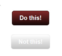
Color Contrast
If your website is just dark text over a white background, you’re good! But that’s a bit boring, so most designers would like to add some color to the fonts and put that over a background color or an image. Some website visitors may have trouble distinguishing subtle color variances; therefore, it’s important to make sure your text colors have a sufficient contrast to the background. Use the web accessibility color contrast checker to test your site.
Form Captcha
Captcha: Completely Automated Public Turing test to tell Computers and Humans Apart
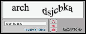
Why are they used? Bots – these are automated computer programs on a mission to flood your forms with spam. By design, a captcha cannot be read by a machine. So if you have one of these on your site, it may be difficult or impossible to use for a visually impaired user. Even with a captcha in your form, spammers sometimes get through forms, but there are many effective techniques that can keep spam to a minimum with no captcha at all.
Not only is ADA compliance important to provide an accessible and easy-to-use website for all of your visitors, it can also lead to legal problems if neglected. From the LA Times in 2018 – Lawsuits targeting business websites over ADA violations are on the rise.
Responsive – Mobile Ready

Many DIY templates accomplish “mobile compatibility” by displaying content in a single column. This single column expands or shrinks based on the screen size. This makes a desktop experience feel like you’re viewing the site through a blown-up phone screen. It’s like being stuck in the front row of the movie theater.
A well-designed site will be built with a responsive framework where the content is adapted to fit the screen size it’s presented on. Common frameworks are built on a 12-grid system. This offers a tremendous amount of flexibility that is often difficult to customize in a DIY site builder.
Don’t put important text in images.

A common example of this is to take a flyer made for printing and putting it on your website. Unless you add all of your information in the alt value of the image, a visually disabled person can’t read the key information that is likely printed on the flyer, such as the event name, location, time, etc. It is better to list your information as html in addition to the flyer so all visitors have a way to read the important information. This is also much better for SEO (see structured data below).
Underlying Page Structure
Screen readers rely on the identification of sections of the page to understand its structure. For this, use markers like <header>, <footer>, <nav>, and <article>. These are often not used in DIY building templates or are used incorrectly.
SEO Best Practices
SEO – Search Engine Optimization is a collection of techniques that make your website rank better in search engine results. This is often overlooked or not fully understood. This is a very deep topic and there are a lot of great resources to learn more about it, but some fundamental principles that are often neglected include:
- Use relevant page titles that include your important keywords. I have often seen the home page of a website with a title of “Home” or “Home Page” or even “Page Title.” Not only is the title important as your keywords, but this is what will show as the name of the link in search engines. It should be the name of your business or organization and possibly a short sentence describing who or what you are. For internal pages, it should accurately describe the subject of the page content.
- Use keywords in section titles, links, and lists. Use header tags <h1-5> to identify sections of content.
- Create individual landing pages to describe your most important products, services, or events.
Structured Data
One of the important behind-the-scenes jobs of a website is to let Google know specific details about your business, product, or event. This is done in part with structured data. Check to see if your website has structured data and if it is the correct type. For example, if you have an event, you can include the name, description, performer, date, time, ticket price all as structured data. Google then knows about your event and can show information about it when users are searching for events related to your topic or even any local events near them. This provides more exposure to your site. But if your event data is incorrectly entered as a product (a common problem with DIY websites), you won’t get these benefits. Learn more about the types and requirements of structured data.
Content Organization
How many pages? What information should be grouped together? How can it be presented in a clear and concise way? A website is a collection of information. Sometimes a lot of information. Building a site presents all sorts of decisions and can go horribly wrong quickly, leaving you with an unorganized, cluttered mess that isn’t effectively communicating with your audience.
Customization
DIY website builders have a lot of ways to customize how your site will look and function, but there are many limitations in what they can do and your own skill level. This can result in a site that doesn’t quite work the way it should or the way you need it to, and instead of finding a way to get it done the right way, it’s left as “good enough.”
Website Load Time
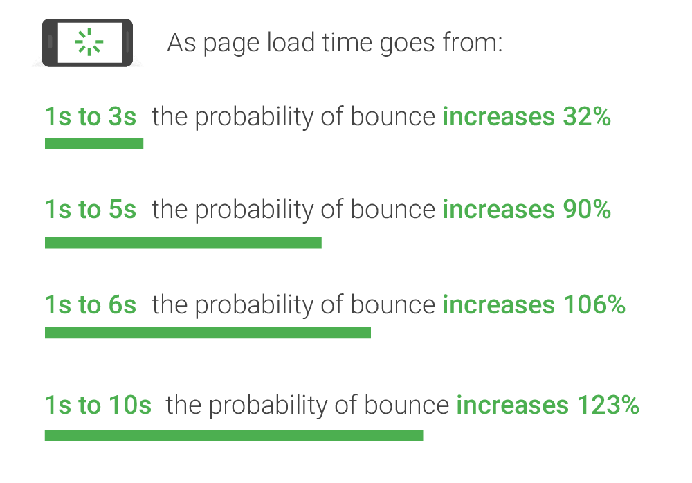
When you view a webpage, you’re viewing a collection of files assembled by your browser. This includes the page code, files that control the page display, such as javascript, css embedded fonts, and images. A poorly built site may load slowly from downloading unnecessary supporting files, inefficient and bloated code, and oversized and uncompressed images. Test your website load time. Does it take more than 3 seconds to load? If so, you’ve got some work to do. According to Google research, it’s 32% more likely your mobile users will leave if your site doesn’t load in 3 seconds or less, and it gets much worse from there. Your hosting platform is an important component in this as well. If your host has your site on an overloaded or slow server or network, it may be sluggish at delivering files to your website visitors or even have excessive downtime and errors.
Hopefully, these tips will help you make a better DIY website or become aware of some of the many details that go into creating a well-designed website before choosing to take on the task yourself or hiring your “sister-in-law’s friend who does websites on the side.” A bad website can not only not help your business or organization, it can even be a detriment.
Please contact Chris @ Cyber Scriber if you would like to have your website evaluated or to get your site professionally developed.