One of the first projects I had the privilege to work on 18 years ago was to create a website to preserve the family history of the Balbi Family. It has been my priveledge to maintain this site for nearly two decades now. There are three versions of the site, English, Italian and Spanish. We have redesigned the site a few times, the most recent was just completed. The owner of the site was happy with the design, but the site was not built using a responsive framework. This means that the smaller screens so many of us use now would not be able to see the site in a format tailored for their screen. The purpose of the redesign was to make the site responsive and mobile friendly. We used the Zurb Foundation css framework to accomplish this.
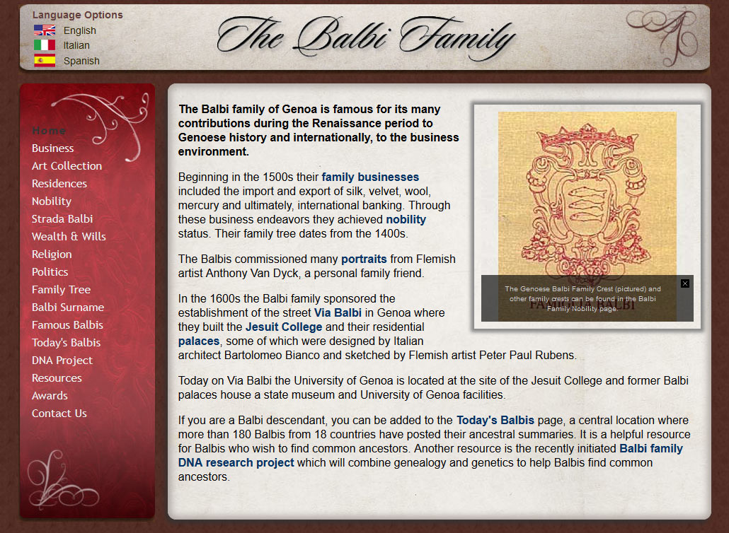
Original Website
This is the previous version of the site built in 2013.
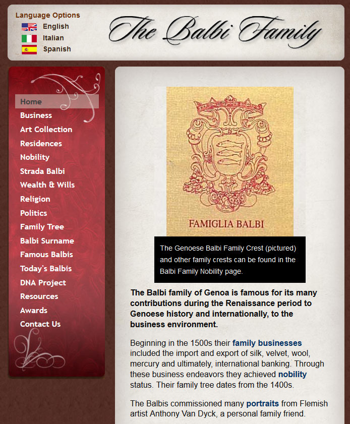
Redesigned Website on a Large Screen
This is the redesigned responsive site. For a large screen, there is very little difference. The new site uses css for most backgrounds and rounded corners. The previous site used images for this as css methods were not commonly supported by the browsers of the time.
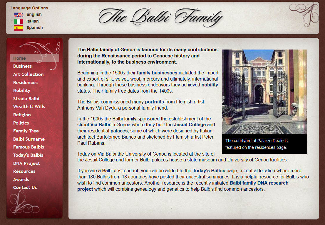
Redesigned Website on a Medium Screen
As the screen size gets smaller, the original site did nothing but shrink. The responsive site changes based on the size of the screen. The first transition happens when the slideshow images move above the opening text. The content window and header shrink to match the screen size.
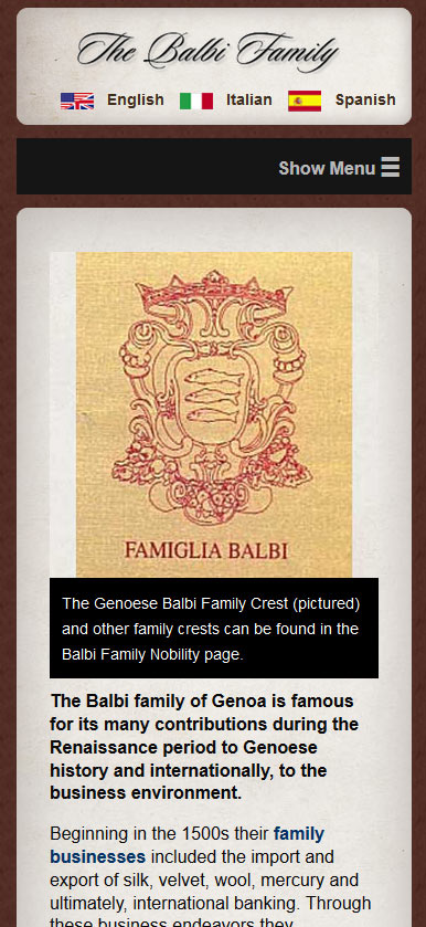
Redesigned Website on a Small Screen
Displaying the site on a much smaller screen results in several more changes to the layout. This would typically apply to a phone screen in portrait mode. In the header, we stack the logo over the language options and hide the text label. There is no longer room to show the menu next to the content, so that is converted to a menu tucked in between the header and main content.
Without the responsive framework, the full website would be shrunk down to fit on the screen. The user would have to zoom in to the specific part of the site they would want to read. This makes it very difficult to use on smaller screens.